Introduction
“Data science” has a handful of fundamental metaphors for problem solving, few moreso versatile than the “point cloud”. That is, translate your data into points in a n-dimensional metric space and then do linear algebra to it. The point cloud metaphor applies most simply to numeric tabular data, but with a little creativity it readily extends to text, images, time-series and so on. In this post I’m going to tackle the KolektorSDD2 image dataset – a collection of normal and defective surfaces for some unnamed product – by using the point cloud metaphor to create a simple custom embedding and then exploiting it with elementary regression methods. I’m going to beat the results for the weakly supervised task outlined in the associated paper (Average Precision of 0.73) which requires the classification of images into normal or defective using just image level labels (i.e. without using pixel level defect information).
I found this experiment interesting because the embedding I’ll describe is beautiful in its simplicity yet it achieves an out-of-sample Average Precision (AP) score of 0.83 and a area-under-curve (AUC) score of 0.93 – significantly out-performing the more complicated segmentation network deep learning model from the paper.
The data is available here. The code hereafter assumes that the training and test images are in train/ and test/ directories respectively, colocated in the same root folder as the code. Each image file is accompanied by a
Pre-processing
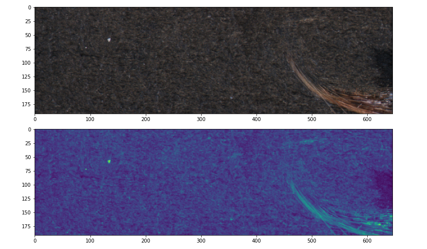
The images in the dataset are 3-band (RGB) but it is easier to work with 1-band mono images and the defects are just as obvious in grayscale. However, I can do better than grayscale by using PCA to create a more optimally variance preserving 1-band image as follows. I reshape each \(m \times n \times 3\) image into a \((m\times n) \times 3\) matrix, calculate the first principle component and use it to project the matrix to a 1D vector which I reshape into 1-band image with dimensions \(m\times n\). I also mean center and scale the image as part of the transformation because I don’t care for relative brightness in this use case. Here is my load function which opens an image and calculates the centered and scaled 1-band projection.
from PIL import Image
import numpy as np
from sklearn.decomposition import PCA

def load(fn):
    with Image.open(fn) as f:
        o = np.array(f).astype("float")
    a,b,c = o.shape
    o = PCA(1).fit_transform(o.reshape((a*b,c)))
    o = o.reshape((a,b))
    return (o - o.mean()) / o.std()
Here are some before and after pictures. The top picture is an RGB (3-band) image displayed as-is in the data, the bottom picture is the 1-band image as processed by the load function shown here in the default matplotlib veridis colour map.
A beautiful embedding
The key observations for this dataset is that all of a normal image and most of a defective image is a homogeneous texture. Therefore, an image can be classified as “normal” if it is suitably homogeneous. A simple way of producing an embedding which strongly emphasises defects is to again use PCA. Using only normal images, I roll a \(m \times m\) window through each image, centering the window on every pixel. I flatten and stack all the windows to produce \(w \times m^2\) matrix, where \(w\) is the number of windows. I then perform PCA, retaining only the first 2 principle components (PCs), thus I project each window to a 2D coordinate – and that is all.
Here is how to do it in code. I use incremental PCA because the data ends up being very large. I simply load each non defective image, window it, reshape it, and feed it the the partial fit function:
import numpy as np
from sklearn.decomposition import IncrementalPCA

def is_defect(fn):
    with Image.open(fn) as f:
        return np.array(f).sum() > 0

ids = list(set([int(re.search("[0-9]+",fn)[0])
       for fn in glob("train/*.png")]))

pca = IncrementalPCA(2)
for j,i in enumerate(ids):
    if is_defect("%s/%d_GT.png" % ("train", i)):
        continue
    o = load("%s/%d.png" % ("train", i))
    bl = view_as_windows(o, (25,25))
    a,b,c,d = bl.shape
    x = bl.reshape((a*b, c*d))
    pca.partial_fit(x)
Note that I use a \(25 \times 25\) pixel window – this is a guess based mostly on eye-balling defects and it could be tuned for better performance.
The first few PCs capture the most commonly repeating patterns of the image (the homogeneous background) because that is where most of the variance is. A non-homogeneous (defective) window is poorly approximated in PC space and ends up with coordinates far away from the center. Here is a sample of six normal images projected to PC space:
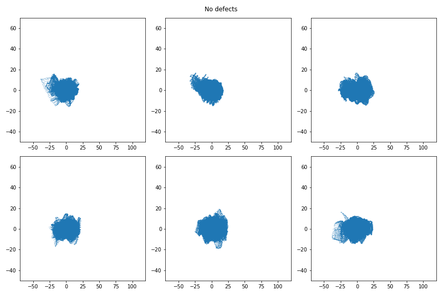
Very similar every time: fairly Gaussian, centered on (0,0). Meanwhile, here are 6 defective images in PC space.
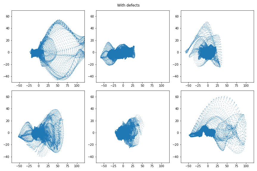 A remarkable difference. The bulk is centered as zero because most of a defective image is homogeneous background, but the defective portion is poorly represented in PC space and so creates a very clear trace. It is also noteworthy that the PC space profitably does not preserve locality. Points near to each other correspond to windows which are visually similar looking – not windows which are close together. As a result these images are simple to interpret as the “bulk” which indicates the homogeneous pattern for which the PC space was build, and the extrema which are non-homogeneous artefacts of interest.
Features for classification
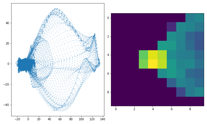
It was my aim to build a classifier able to sort the normal from the defective images and to do so I need to usefully summarise the information in the PC space images so that it may be used for classification. An elementary and effective way is to divide the image into a 2D grid and to simply count how many points fall into each grid square. The picture on the left below is one of the defective images from above in PC space, and the picture on the right is what the 2D histogram of counts looks like in log space. In actual application the 2D histograms are flattened into vectors and stacked to create a feature matrix.
 It can be coded as follows. I enumerate all files in the training set and for each I load the image, save the label into an array \(y\), window the image, reshape the windows to a stack of vectors and use the fitted PCA from the previous step to project the windows to a set of 2D coordinates. I then calculate a uniform \(10 \times 10\) 2D histogram and flatten it into what will be the feature dataset \(X\). Note that the choice of bin number for the histogram is more partially arbitrary eye-balling, at it may improve performance to treat it as a parameter to be tuned.
X, y = [], []

ids = list(set([int(re.search("[0-9]+",fn)[0])
       for fn in glob("train/*.png")]))

for j,i in enumerate(ids):
    l = is_defect("%s/%d_GT.png" % ("train", i))
    y.append(l)
    o = load("%s/%d.png" % ("train", i))
    bl = view_as_windows(o, (25,25))
    a,b,c,d = bl.shape
    x = bl.reshape((a*b, c*d))
    x = pca.transform(x)
    x, _, _ = np.histogram2d(
      x[:,0], x[:,1],
      bins=10, range=((-60,60),(-60,60)))
    X.append(x.flatten())

X, y = np.vstack(X), np.array(y)
A basic model
The distinction between normal and defective images in PC space is sharp and a simple model suffices. I column-wise scale the matrix of stacked flattened histograms and then fit a Logistic Regression:
from sklearn.pipeline import make_pipeline
from sklearn.preprocessing import StandardScaler
from sklearn.linear_model import LogisticRegression

M = make_pipeline(
    StandardScaler(),
    LogisticRegression(solver="liblinear", max_iter=10000))
M.fit(X,y)
The coefficients of a logistic regression apply to the log odds, so I can get the effect on the odds ratio by exponentiating them. Since the features all have the same scale, and the regression coefficients correspond to the cells in the flattened 2D histograms, I can (1) compare coefficients to each other, and (2) reshape the coefficient vector back to a square \(10 \times 10\) grid so that I can interpret how each part of the PC space effects the result:
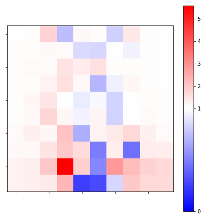
Note that coefficients < 1 reduce the odds whilst those > 1 increase them. I can see that the horizontal center is associated with the normal images whilst the vertical periphery is associated with defects – especially the lower half the image.
Performance
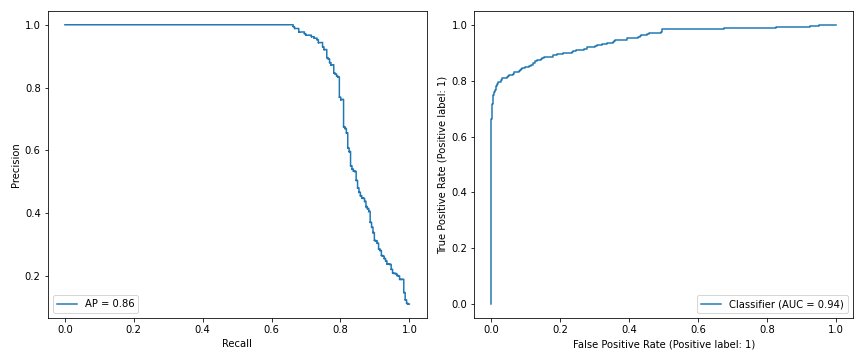
Here are the Recall-Precision and ROC curves for the training data. Average precision is 0.86, AUC is 0.94.
 Here are the Recall-Precision and ROC curves for the out-of-sample test data. Average precision (AP) is 0.83, AUC is 0.93.
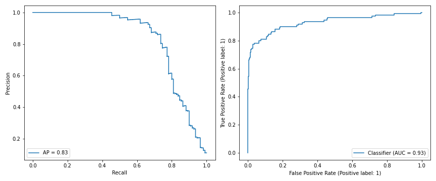 Compared to the segmentation deep neural network given in the paper, this simple embedding beats its out-of-sample weakly supervised AP score of 0.73 substantially, and matches its strongly supervised AP of 0.83 when 16 pixel level segmented images are added to their model’s training set. This while using basic modelling tools with fitting results which can be fully explained.
Some other notes:
Window size and histogram bins were chosen by eye, so it is likely that results could be improved with more thorough parameter tuning.
I fitted a random forest instead of a logistic regression. It improves the out-of-sample AP to 0.85. The marginal gain comes at a severe cost to the intepretability of the model, so it is not recommended.